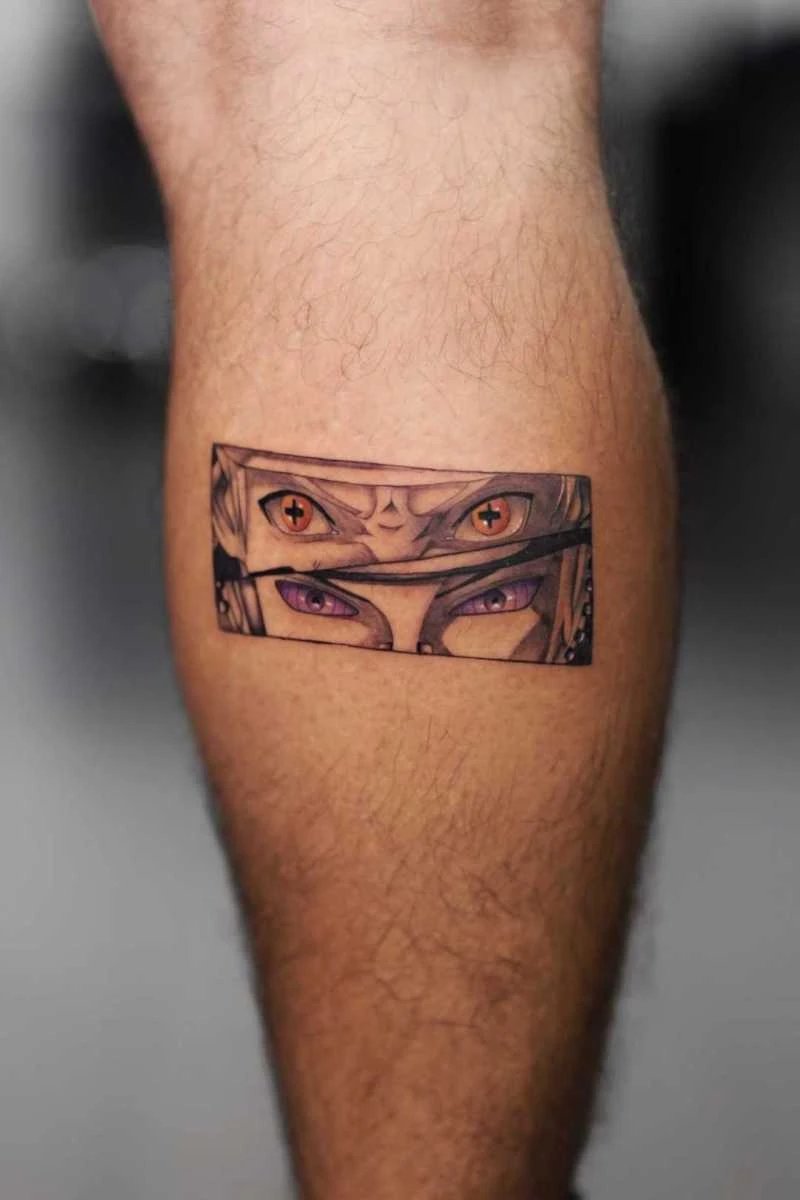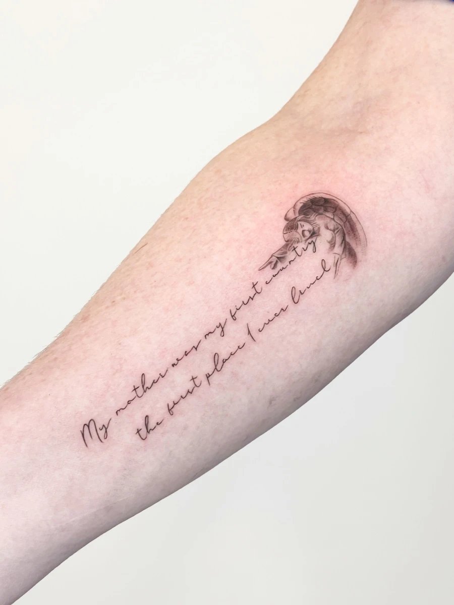
Fine Line Lettering Tattoos: Small Details That Make a Big Difference
Fine line lettering tattoos might seem straightforward, but anyone who's really looked into them knows they're far from simple. Every curve, space, and stroke matters. That's why these tattoos need a steady hand, a clear design, and an artist who gets how type works on skin. At Here Tattoo Shop, people often come in with a quote, name, date, or meaningful phrase, wanting it to feel elegant, not cramped. This is where thoughtful script tattoos and precise line work shine.
So, what makes this style so appealing? It's all about balancing subtlety and expression. A fine line tattoo can feel personal without being loud, elegant without being too fancy, and timeless without losing its character. Since tattooed lettering changes over time, the design choices made before the needle ever hits the skin are just as crucial as the tattooing itself. In this guide, we'll dive into the details that matter most, from font selection and placement to healing, readability, and long-term care so you can feel confident about your next tattoo. For more inspiration on style choices, check out our custom tattoo design service, which turns a simple phrase into lasting art.
Quality isn't just about looks. Skin type, placement, ink saturation, and aftercare all play roles in how lettering looks once healed. The U.S. Food and Drug Administration notes that tattoo ink and skin reactions can vary widely, which is why design planning and hygiene are so important in tattooing. Want to learn more? Check out the FDA tattoo safety page.
Why Fine Line Lettering Feels So Timeless
Minimal Design with Maximum Meaning
Fine line lettering works because it boils the tattoo down to its core message. It doesn't rely on heavy outlines or decorative extras. This simplicity makes the words stand out, which is especially important for memorial tattoos, affirmations, initials, and short quotes.
People often pick this style for its intimacy. A fine line phrase can sit quietly on the wrist, ribcage, collarbone, or forearm and still pack an emotional punch. Its subtle look also makes it easy to pair with other styles later, like a small symbol, floral element, or date.
Lettering That Complements the Body
These tattoos are popular because the body can guide the design. Curved placements like the forearm, spine, or ankle let lettering flow naturally, making the tattoo feel more integrated. When the angle and spacing are right, the design looks intentional, not just stuck on.
That's why placement is a creative choice, not just a technical one. Curious about how positioning affects comfort and longevity? Our placement and healing guide explains why some areas need more planning. Placement should support the letterforms, not just be convenient.
The Design Decisions That Matter Most
Font Choice Shapes the Entire Tattoo
Choosing the right font is crucial in fine line lettering. A delicate serif might feel refined and literary, while a clean sans serif feels modern and understated. Handwritten or script-based lettering adds warmth and personality but must be designed carefully so loops and flourishes don’t blur over time.
The best fonts for tattoos aren’t always the ones that look great on a screen. A design that seems elegant digitally might be hard to read once it's scaled down or transferred to skin. That’s why artists refine spacing, stroke weight, and letter height before tattoo day. Often, less ornamentation is better because it keeps clarity after healing.
Spacing and Kerning Protect Readability
Letter spacing, or kerning, is a small detail with a big effect. If letters are too close, the tattoo might look cramped or merge over time. If too far apart, the phrase may lose its rhythm and feel disconnected.
Good spacing is especially important for names, short quotes, and dates where every character counts. An experienced artist studies how letters interact, how they sit along the chosen placement, and how the skin might shift. This is why a consultation is valuable before committing to a design.
Line Weight Affects Aging
Thin lines look beautiful when fresh but may soften as the tattoo ages. That doesn’t mean delicate work is a bad choice. It just means the design should have enough structure to stay legible over time. The right line weight depends on placement, size, and long-term expectations.
For example, a quote on the inner forearm can usually handle more detail than a tiny phrase near the fingers or ribs. Skin movement and sun exposure can change the tattoo’s appearance over the years. The best fine line lettering balances elegance and durability rather than chasing the thinnest line possible.
Choosing the Right Placement for Lettering
Small Spaces Need Smarter Design
When aiming for subtlety, many assume the smallest placement is best. In reality, tiny areas can limit design. A short phrase might fit on a finger or behind the ear, but those spots tend to fade or blur faster due to more movement and friction.
Places like the forearm, upper arm, sternum, and collarbone often provide a better canvas for lettering because they offer enough room to preserve spacing. If the text is deeply meaningful, it’s usually worth giving it enough space to breathe. That extra room can make the difference between a tattoo that feels clear and one that feels cramped.
Body Movement Changes the Look
Letters on active body areas can shift visually when the body bends or stretches. A phrase that looks perfectly aligned standing still might curve differently when moving. This is why careful placement planning is crucial before the session.
Artists often map the tattoo on the skin and ask clients to move naturally before finalizing the position. This simple step helps ensure the text stays readable in real life, not just in a mirror. A tattoo should look good from the angle it’s actually seen most often.
Placement and Pain Should Both Be Considered
Some lettering placements look great but are more sensitive to tattooing. Ribs, feet, inner biceps, and spine areas can be more uncomfortable, affecting how long a session can run and how relaxed the client feels. While pain tolerance varies, comfort can influence the tattooing experience and the final result.
If you want a deeper look at how different body areas affect the process, our expert placement guide covers what to expect before, during, and after the appointment. Thoughtful placement is one way to support clean lettering and smoother healing.
How to Make Fine Line Lettering Last
Aftercare Begins the Moment the Session Ends
Fine line lettering relies on crisp edges, so aftercare is crucial. A tattoo that heals too dry, gets overwashed, or faces too much friction can quickly lose clarity. That’s why healing should be part of the tattoo process, not an afterthought.
Professional aftercare usually includes gentle washing, thin moisturization, and avoiding soaking, scratching, and sun exposure during early healing. The Centers for Disease Control and Prevention emphasizes general skin hygiene and infection prevention as key health practices, which also apply to tattoo care. You can review broader hygiene guidance through the CDC hygiene resources.
Avoid Common Healing Mistakes
Many lettering tattoos suffer not from the tattooing process, but from preventable aftercare mistakes. Picking at flakes, wearing tight clothing over the area, or exposing the tattoo to direct sunlight too soon can all affect the final look. Even a great design can heal poorly if it isn't protected during the first few weeks.
For practical tips on what to avoid, our tattoo aftercare guidance and detailed post on aftercare mistakes can help you maintain the sharpness of your lettering. Small habits during healing often determine whether a tattoo stays elegant or starts to lose definition.
Sun Protection Matters Long Term
Fine line tattoos are especially sensitive to UV exposure because thin strokes can fade more quickly than heavier designs. Once the tattoo has healed, regular sunscreen and sensible clothing choices help protect the ink from early breakdown. This is important for any tattoo, but especially for lettering that relies on clarity.
If you spend a lot of time outdoors, talk to your artist about placement that gets less direct sunlight or is easier to protect. Long-term maintenance doesn’t have to be complicated, but it should be consistent. The goal is to keep the tattoo readable for years, not just impressive on day one.
Common Mistakes People Make With Lettering Tattoos
Choosing Too Much Text
One common mistake is trying to fit an entire paragraph into a small tattoo. Fine line lettering works best when it’s concise. Short quotes, single words, meaningful dates, and names usually age better and look cleaner than dense text blocks.
When too many words are crammed into a small space, the tattoo can become visually cluttered and hard to read after healing. If the message is important, it deserves enough room to be legible. Often, shortening a quote or picking a more focused phrase leads to a stronger result.
Picking a Font That Looks Good Online but Not on Skin
Another issue is choosing a font from a screenshot without considering how it behaves as a tattoo. Some fonts have overly thin strokes, fragile serifs, or decorative details that are tough to transfer cleanly to skin. What seems stylish in a graphic design app might not work for permanent body art.
A better approach is to work with an artist who can adapt the lettering to the body instead of forcing the body to fit the font. That’s where collaboration matters. A good artist can suggest tweaks that maintain style while improving legibility and longevity.
Skipping the Consultation Process
Some think lettering tattoos are simple enough to skip planning. In reality, the consultation is where key decisions are made. It’s the time to review spelling, placement, size, spacing, and long-term expectations.
Unsure where to start? A consultation for a custom tattoo design can help you narrow down the options and avoid regret later. A few thoughtful adjustments before the appointment can completely change how the tattoo looks once it heals.
What a Skilled Artist Looks For
Experience with Fine Detail Work
Fine line lettering needs a different skill set than bold traditional work or heavy illustrative styles. The artist has to control pressure carefully, maintain clean movement, and understand how much detail the skin can hold. Often, the difference between a decent tattoo and a great one comes down to these technical micro-adjustments.
That’s why artists who specialize in delicate work focus on line consistency, symmetry, and balance. They’re not just making a tattoo look good in the chair; they’re planning for how it will appear after healing, settling, and aging. This long view is essential for lettering.
Spelling and Structure Matter More Than You Think
Because lettering is text-based, even a tiny error can have a major impact. A missing accent mark, mismatched capital letter, or off-center alignment can become distracting once the tattoo is permanent. Good artists verify every detail before starting.
This is also why some clients bring references but still need guidance. The best tattoo artist won’t just copy a font; they’ll evaluate how the words sit visually and whether the layout supports the meaning. This process is especially valuable for memorial tattoos and pieces with emotional significance.
When Realism, Fine Line, and Lettering Intersect
Some lettering tattoos pair with a small portrait, floral detail, or symbolic element. In these cases, the artist has to maintain visual harmony across styles. Fine line lettering can be beautiful next to soft realism or minimal imagery when the composition is carefully planned.
If you’re combining text with imagery, it might help to check out our fine line tattoos and realism tattoos pages to see how different approaches can complement each other. A cohesive piece feels intentional from every angle, not just polished in one section.
Style Ideas That Work Especially Well
Names, Initials, and Family Tributes
Personal names and initials remain some of the most meaningful lettering choices. They work well because they’re direct, emotionally clear, and usually compact enough to age gracefully. When designed with restraint, they can feel elegant rather than overly sentimental.
Family tributes often benefit from subtle placement, like the inner arm, ankle, or collarbone. The quietness of the design can actually make it feel more powerful because the meaning is carried by the person wearing it rather than by a large visual display.
Short Quotes and Affirmations
Short quotes are ideal for fine line lettering because they keep the central idea without crowding the skin. A single line of text can serve as a daily reminder, a private message, or a milestone marker. The key is choosing words that stay meaningful over time.
When designing this kind of tattoo, think about how the phrase reads aloud and whether it still feels powerful if seen by others. Some prefer private placement, while others want a visible reminder. Either way, the lettering should be easy to read and emotionally resonant.
Dates, Coordinates, and Symbolic Text
Dates and coordinates are popular because they blend personal meaning with minimal visual weight. They also pair well with fine line typography since the structure is simple and linear. When arranged carefully, these tattoos can feel modern and understated.
Clients sometimes add Roman numerals, small separators, or understated symbols to enhance the design. Just remember, every extra detail changes the balance. A clean layout almost always outperforms a crowded one when the goal is elegance.
How to Prepare for Your Appointment
Bring Reference Images, but Stay Flexible
Reference images help communicate the mood and style you want. But they should be seen as a starting point, not a final blueprint. Your artist might suggest changes to improve spacing, scale, or readability on your specific placement.
It’s useful to bring examples of fonts, tattoo placements, and line weights you like. Then let the artist translate those ideas into a design that works for your body. That collaboration often turns a good idea into a great tattoo.
Plan for Size and Future Changes
One of the smartest moves is to size the tattoo with the future in mind. Skin changes over time, and tattoos naturally soften as they age. A piece that's too small might become hard to read later, especially if the lettering is intricate or very delicate.
That’s why a slightly larger tattoo often looks better long term than an ultra-minimal one. It might feel subtle now, but it has a better chance of staying beautiful for years. That’s a tradeoff worth considering before you commit.
Choose a Shop That Values Collaboration
Not every tattoo studio approaches lettering with the same care. A shop that values consultation, cleanliness, and technical precision will help you make better design decisions. This environment is especially important for text-based tattoos where every millimeter counts.
At Here Tattoo Shop, the process is meant to be collaborative from the start, whether you’re planning a minimal phrase, a custom piece, or a design that combines lettering with another style. Want more options? Our flash tattoos can also help you understand how clean composition works across different tattoo types.
Final Thoughts: Small Details, Lasting Impact
Why Fine Line Lettering Succeeds When the Details Are Right
Fine line lettering tattoos show that simplicity doesn't mean easy. The smallest choices—font, spacing, placement, line weight, and aftercare—have a big impact on the final result. When these choices are made carefully, the tattoo can feel personal, elegant, and timeless.
If you’re considering this style, focus on clarity first and decoration second. A well-planned phrase will always age better than an overworked design. That’s the heart of great lettering: restraint, intention, and technical skill.
Take the Next Step with a Thoughtful Consultation
The best way to get a tattoo you’ll love for years is to plan it with an artist who understands both design and healing. Bring your idea, be open to expert feedback, and give the piece enough room to breathe. A few smart decisions now can protect the tattoo’s beauty for a long time.
If you’re ready to start, contact Here Tattoo Shop to discuss your lettering idea, placement, and custom options. Thoughtful design makes all the difference, and we’re here to help you create something that looks as meaningful as it feels.
Ready to turn your words into lasting art? Reach out today and start planning a fine line lettering tattoo that reflects your story with precision and style.